Yodil
Creating a Memorable Brand
Like most startups, Yodil’s brand was undefined, its identity worked against its goals, and awareness of it was yet to be established. But the founders understood marketing is an investment — as opposed to an expense — that yields strong returns and, so, chose to partner with OCG.
The folks at Yodil understod they needed to invest in their marketing, and OCG understood how to maximize those investment dollars. The results: a recognized and respected insurance technology company, a powerful brand, and aquisition within seven years.
The Plan
Create a brand that left no room for misunderstanding: Yodil had arrived and was ready to serve.
The Action
Develop and establish a serious, disciplined brand for a serious, disciplined market.
The Plan
Create a brand that left no room for misunderstanding: Yodil had arrived and was ready to serve.
The Action
Develop and establish a serious, disciplined brand for a serious, disciplined market.
Colors
We deliberately chose black, white, red, and maroon to convey the seriousness of the brand, to represent the professionalism of its people, and to symbolize the passion they had for their offering.
Logo
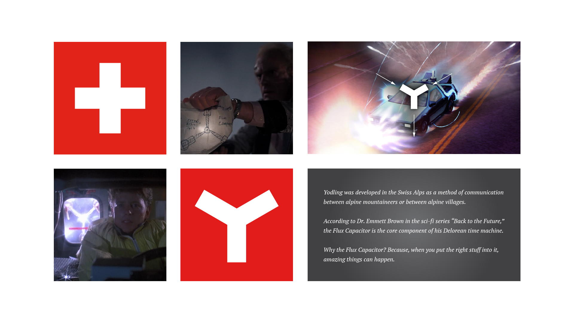
The square shape was evocative of reliability. The inside Y was inspired by the Flux Capacitor in Back to the Future because, just like Yodil’s app, when you put the right stuff into it, amazing things happen.
Advertising
We created an ad campaign right out of the gate to inform the market and to help define the message. The campaign introduced the new mark and the symbolism behind it: “We transform BI into Brilliant Insight.”
Collateral
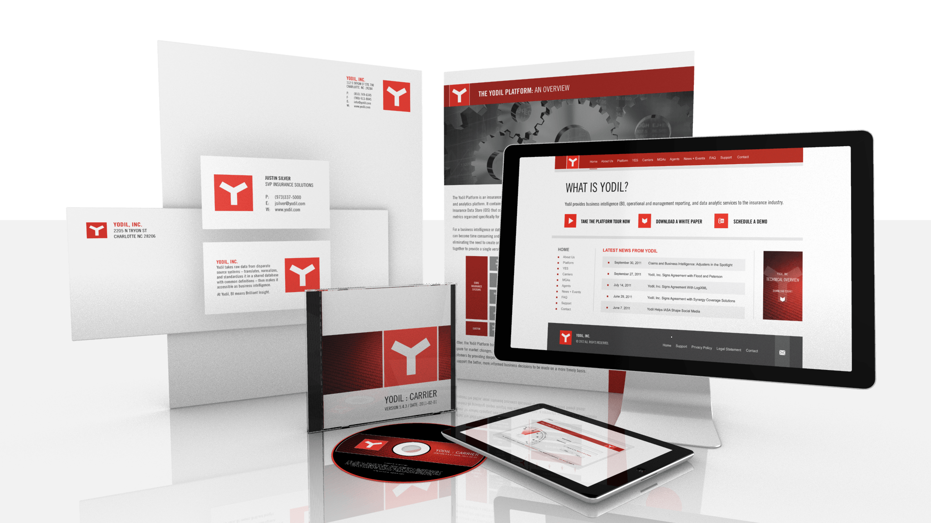
With any brand, certain materials need to be created to support marketing and sales objectives. Though we made sure Yodil’s brand was prominent in everything, we took care to be sure their content was always king.
Conferences
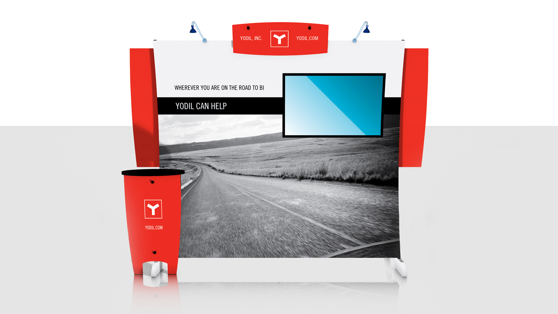
Most companies attend at least one conference or trade show each year to network with peers and potential clients. Yodil wanted to stand out, so we created an attention-grabbing 10×10 booth (seen in the photo), as well as cards, pendants, bannerstands, neckties, and more.
Emails
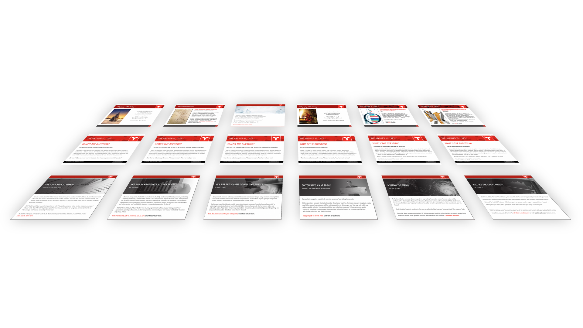
Email marketing was an important part of our awareness-building plan for Yodil. Having a regular email sent to individual members of the target audience helped to prepare those contacts for follow-up sales calls. It helps for people to know your company before you call, instead of saying, “Who?”
Next Step
If you agree that investments in marketing make sense and can yield rewards, please Contact OCG Today. Your success is our success.

