DESIGN & WEB
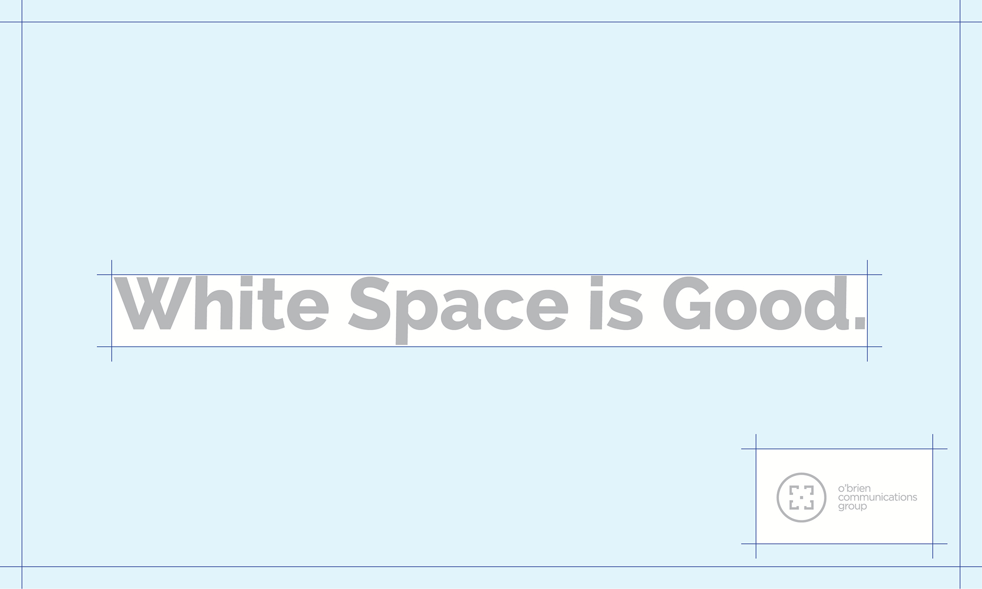
White Space
“I see and I remember.” ~Confucius
For all of you working on a design, or working with designers (like yours truly), I’d like to talk about an absolutely essential topic: white space.
Put simply, white space is any part of a design that doesn’t contain actual content like imagery, animation, or text.
Why is White Space So Important?
The answer is simple:
1 – White space improves legibility.
2 – Comprehension improves with increased legibility.
3 – Retention improves with increased comprehension.
In other words, the greater the white space, the easier it is to read, the easier it is to understand, and the more likely it is that your content will be remembered.
Final Thoughts
The next time you find yourself overly concerned about cramming content “above the fold,” find yourself unconcerned with your body copy’s high Flesch reading score, or find yourself debating whether to make the logo bigger or to fill every sixteenth of an inch of space with content, stop.
Stop. Think. And consider the effect these decisions will have on white space — and on your audience’s ability to read, understand, and remember what you’ve tried to say.

About the Author
Jonathan D. Spiliotopoulos is a Partner with O’Brien Communications Group (www.obriencg.com), a business-to-business brand-management and marketing communication firm with responsibilities ranging from brand creation and creative concepting, to graphic design, web development, and more. He’s also an experienced teacher/trainer, presenter, a newbie dad, and is active in a number of communities and forums — online and in the real world — dedicated to helping others achieve their goals.


0 Comments