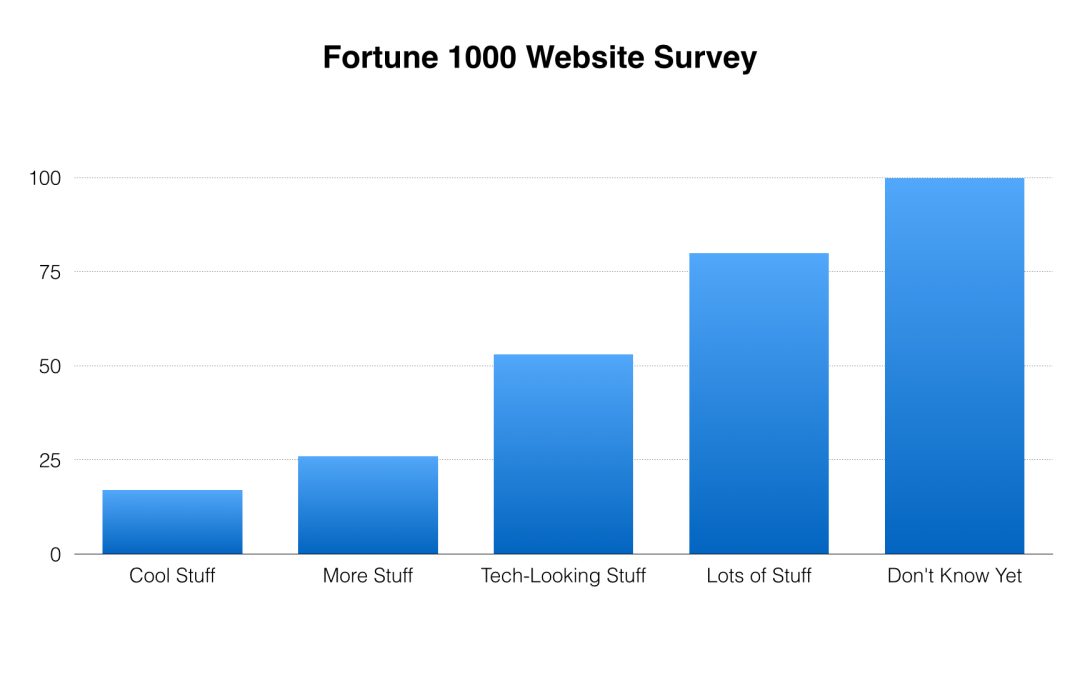
We recently conducted a survey of 1,500 companies from the Fortune 1000 to determine what those companies would like their new websites to feature if they could have new websites just by snapping their fingers. These are the top five responses:
- Cool stuff
- More stuff
- Tech-looking stuff
- Lots of stuff
- We don’t know, but we’ll know if you show us enough stuff.
These responses suggest companies spend considerable time thinking about what will impress them on their own websites — and almost no time thinking about what kind of experience prospects will have on their sites, let alone whether those prospects will find what they need to make a buying decision. That’s a costly mistake.
When people seek you out on the web — look for your company, your product, or your service — they want to know what you have, not what you think is cool. They won’t wade through your cool stuff to find out. They’ll go to another company’s site.
Our survey revealed something else: The more people are impressed by their own cool stuff, the more cool stuff they find with which to impress — or so they think. That’s why, when you visit some sites — and before you have the chance to find anything — you’re bombarded with videos, animated effects, crawls, and all manner of aural and visual noise. The result? Websites generate bounce rates in direct proportion to their volume of cool stuff.
The bitter pill is that what we have to say is nowhere near as important as we think it is. That’s right, folks. The stuff has to go. Nobody cares. Sorry. If we want to know what’s really important, we should begin, not by telling, not by rolling out the cool stuff, but by asking: What do you need? What do you want? How can I help?
Those are very simple questions. They engender very simple responses. They foster very clear communication.
Our prospects will decide for themselves how cool our stuff is.

